Section 7.5
Diagnostics
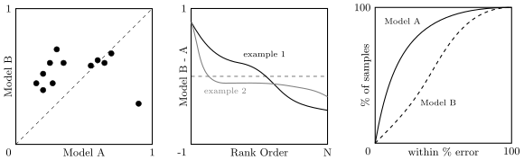
Given all the things that can go wrong, its important that you develop skills and tools for diagnosing your model. One useful tip is to measure everything and visualize everything. The former is particularly important for very long running experiments where you want to avoid having to run jobs a second time just to obtain some statistic you forgot to record during the first run. The latter allows us to quickly understand a bigger picture story that is hard to see when looking at raw statistics. It can also very quickly uncover catastrophic failures or sub-patterns within the data. Techniques like t-SNE and PCA are good for reducing high-dimensional feature data for visualizing in 2- or 3-dimensions, but what about comparing models? Figure 103 shows three different ways. In the first way, we plot the performance on individual test samples on one model versus another. The diagonal line separates samples that perform better in one model than the other. This sometimes can reveal clusters of samples that warrant further investigation. For example, there appears to be one outlier that performs much better on Model A than Model B in the figure. We may want to understand what is special about this data sample.
The second way to compare models is to plot their difference in performance on each sample in rank order. Figure 103 shows two examples. In the first example, both Model A and Model B appear to perform about the same on average, albeit performing differently on different sets of samples. In the second example, Model B performs much better than Model A on a few samples and slightly worse on many samples. In both example, the average performance of the models looks about the same, but just looking at the average hides the nuances of their behaviour over the samples.
The third way to compare models is by plotting a cumulative distributions over some performance measure (such as percentage error). In the example in Figure 103, Model A clearly dominates over Model B.
These examples show that viewing results in different ways gives different insights into the performance of the model. Indeed, the choice of metrics can influence interpretation of results. We saw this when we discussed metrics for image classification in Lecture 4. You should always be asking questions of your metrics. Not just what is being measured but what the measurement tells you about the model or data. In a similar vein, you should maintain a mental model of your code/algorithm. Exercise your mental model against your observations to ensure you understand what your seeing. As the famous physicist Enrico Fermi once said “experimental confirmation of a prediction is merely a measurement; experimental disproving of a prediction is a discovery.” That is, try to break your mental model to discovery something new. You can develop diagnostic tests to help refine your mental model as we will show shortly.
When conducting experiments it is important to only change one thing at a time, i.e., run controlled experiments. This again should align with your mental understanding of your method and either confirm or disprove that the thing that you are changing is doing what you think it is doing. For example, loss functions are often constructed as the weighted sum of many different terms,
Investigate the contribution of each term by varying the weight of just that term. Setting the weight to zero should remove the behaviour encouraged by that term, whereas setting the weight very high should make that term, and hence its effect, dominate. When setting the weight of the loss terms remember that not all losses have the same scale or are bounded, so take this into account if you want to balance the effect of the different terms. You can do this with other hyper-parameters too. Remember the idea is to get a better understanding of how your model and algorithm is working, not just to get the best performance.
Another test along these lines is to make sure learnable parameters are updating and have an influence on model performance. For a controlled experiment, try freeze all parameters other than those in a few modules and re-train your model from scratch or perturb weights during training and watch them recover. Here you would expect to see a sudden jump in the loss function if the parameters contribute to model performance followed by a recovery phase as they return to their optimized values.
Last, always report trends not just single results. This reveals patterns of behavior that are less likely to be due to random chance, which is important not just for diagnoses but also scientific integrity. The recent excitement around AI scaling laws [51]—extrapolating performance of large language models from smaller scale training runs—is a good example of the real-world usefulness of measuring and reporting trends before embarking on very expensive model training.
7.5.1 Diagnostic Example: Over-fitting versus Poor Features
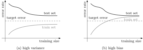
Suppose that we have trained and tested a model and determined that the test error is unacceptably high (meaning that we won’t be able to ship a product, for example). We suspect that the problem is either that the model is over-fitting or the features are not good enough. The first hypothesis suggests that training error will be much lower than test error whereas the second hypothesis suggests that training error and test error will both be high. This is illustrated in Figure 104(a) and (b), respectively, which shows learning curves representative of the two different hypotheses. In the first case there is a big gap between the performance on the training set versus the test set. This is an example of high variance and indicates that the model has over-fitted to the training data. In the second case the training and test performances are close but they are both too high. This is an example of high bias and indicates that the features are not good enough or the model is not expressive enough.
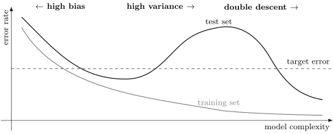
In general there is a trade-off between bias and variance as we change the model complexity as depicted in Figure 105. Here we are plotting the error rate of a model after training as a function of the model complexity, which can be roughly measured as the number of learnable parameters. Sometimes the number of training iterations is also used as a surrogate for model complexity when the number of parameters is very high. The idea can be made more formal, but that is not necessary for our purposes.
As complexity increases models move from having high bias (i.e., both train and test error is high) through to high variance (i.e., train error is low but test error is high). We traditionally want to stop (or pick a model) somewhere between these to regimes where the error on the test set is the lowest. A phenomenon known as double descent has been observed in deep learning, where further increasing model complexity sometimes results in the test set error dropping again (with training error continuing to drop). This is not yet well understood theoretically, but is thought to be a form of benign over-fitting where massively over parameterized models fit the noise in the data but have a preference for low frequency interpolation between data points, and so still predict well on the test set [8].
Diagnosing bias and variance problems provides hints as to what to try next. For bias problems we can try a larger set of features or larger capacity model, such as higher dimensional hidden layers or deeper model. For variance problems we try getting more training examples, but this may be expensive or simply not possible. Alternatively, we could try reduce the set of features, try a smaller capacity model, or try training for longer (and hope for double descent).
7.5.2 Diagnostic Example: Objective versus Optimization Algorithm
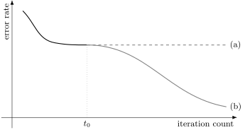
Perhaps our poor performance is not due to over-fitting or poor features at all. Perhaps its a problem with our optimisation algorithm (e.g., not running for long enough) or maybe a problem with our objective (i.e., loss function). Unfortunately, it is often very difficult to determine whether training has converged as Figure 106 illustrates. But this does not mean that we can’t diagnose optimization issues.
Suppose we care about maximizing some accuracy measure, \(J(\theta)\), and our learning algorithm is trying to minimize some surrogate loss, \(L(\theta)\). Let \(\theta^\star\) be the parameters returned by the learning algorithm, and let \(\theta^\dagger\) be any other parameters (e.g., guessed or from a different learning algorithm). Then,
- if \(L(\theta^\star) < L(\theta^\dagger)\) but \(J(\theta^\dagger) > J(\theta^\star)\) then we are optimizing the wrong objective since a lower value of the loss function does not translate to better accuracy;
- if \(L(\theta^\star) > L(\theta^\dagger)\) and \(J(\theta^\dagger) > J(\theta^\star)\) then we have a poor optimization algorithm since there exists another set of parameter values with lower loss;
- if \(L(\theta^\star) > L(\theta^\dagger)\) but \(J(\theta^\dagger) < J(\theta^\star)\) then we still have a poor optimization algorithm but perhaps we got lucky in that the suboptimal parameters achieve better accuracy;
- if \(L(\theta^\star) < L(\theta^\dagger)\) and \(J(\theta^\dagger) < J(\theta^\star)\) then we probably don’t have a problem at all (or \(\theta^\dagger\) is not a good choice for this diagnostic).
Diagnosing optimization versus objective problems provides us with hints as to what to try next. For optimization problems try running for more iterations, try using a different algorithm (e.g., AdamW instead of SGD), try reinitializing parameters using different random seeds (known as random restarts), or try smoothing (e.g., momentum, exponential moving average). For objective problems we can try a different regularization method (such as different data augmentations), try weighting training examples to encourage poorly performing categories, try a different loss function, or try changing the model.
7.5.3 Diagnostic Example: Search versus Score
As another example suppose we are using an approximate nearest neighbour algorithm to find similar objects (e.g., images in a large corpus or matched keypoints across two different images). To do this we must define a similarity measure that our algorithm can use (where lower means better, i.e., more similar). Assume that we are getting poor matches. How can we tell if we have a problem with the nearest neighbour algorithm or our similarity measure?
Let \(x^\dagger\) be a match found by the algorithm, and let \(x^\star\) be a laboriously-obtained hand-selected match (i.e., ground-truth). If \(\textbf{similarity}(x, x^\dagger) < \textbf{similarity}(x, x^\star)\), then the problem is with the similarity measure. Otherwise, initialize the nearest neighbour algorithm with the true solution and if the algorithm moves away from the true solution, then the problem is, again, with the similarity measure. Otherwise, the problem is with the nearest neighbour search algorithm.
7.5.4 Error Analysis and Ablation Analysis
Diagnostics are an important tool when developing your machine learning method. Their purpose is to improve your understanding of your method, not to simply measure its performance. We showed examples for bias/variance, optimization/objective, and search/score, but there are many others. When your model is not performing how you would like, diagnostics can save a lot of wasted effort by guiding your choice of what to try next. They also allow you to develop insights into your particular application and justify your design decisions.
Diagnostics often involve repeated experiments with different parameter settings while keeping everything else fixed. So it is important to set up an environment where you can run experiments quickly and be able to reproduce results.
Other important diagnostic tools are that of error analysis, i.e., understanding where your method is making mistakes, and ablation analysis, i.e., understanding which parts of your model help the most. Error analysis tries to explain the difference between current and perfect performance. That is, answering the question, how much error is due to different model components? One way you can do this is by plugging the ground-truth (if available) into each component and see how it affects accuracy. You can also add noise to each component and see how it (adversely) affects accuracy. You can also use error analysis to determine whether the algorithm fail on a particular subclass of examples. And, of course, always visualize the data and results.
Ablation analysis tries to explain the difference between some baseline and current performance. Often methods are built in an ad hoc fashion and it is not clear whether design decisions made during incremental development are still helping the final model. It is quite common, for example, for features/components are added in early development and kept even if not needed. Ablation analysis removes one feature/component from the model one at a time and sees which results in the biggest decrease in performance, thereby supporting the decision to include that feature/component. Note that the order of removal matters. If a feature or component is removed without changing the performance (or behaviour) of the model, then the model can be simplified (and then possibly further developed).