Section 4.2
Evaluation Metrics
Accuracy, which is the ratio of the number of correct predictions to the total number of examples, only tells part of the story of how well a model is performing. To get the full story we need to evaluate the model using multiple different metrics. Moreover, for different applications, we may need to adjust the metrics to capture the important characteristics of the task at hand. For example, for unbalanced data accuracy is a poor metric. Imagine having 100 times more negative examples than positive ones. A so-called black stick classifier that labels everything as negative will be correct 100/101 = 99% of the time, even though it never detects a single positive example.
To get a more complete picture of how a model is performing we need to compute a confusion matrix. This is a two-dimensional array with actual labels down the rows and predicted labels across the columns. The \((i,j)\)-th entry in the table indicates the number of examples with actual class label \(i\) that get predicted as being of class \(j\),
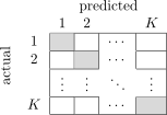
The sum of the rows gives the number of ground-truth examples for class \(i\), whereas the sum down the columns gives the number of ground-truth examples that were predicted as class \(j\). The diagonal sum is the number of correctly classified examples, and the sum over all entries in the array and the total number of examples. From this we can derive several statistics. For example, accuracy is the diagonal sum divided by the total sum. Indeed, the confusion matrix is cumbersome to display for large label spaces so we often just use it conceptually for deriving various summary statistics.
We can be creative in constructing our confusion matrices, ignoring certain categories and adding others. The number of rows and columns need not be the same. This allows for fine-grained or coarse-grained analysis. For example, we could group different animal categories into a single column and then analyse how many times a specific animal, say a cat, is classified as any one of the animal categories.
Getting back to accuracy. What we’ve been calling accuracy until now is an example of micro-averaging,
However, for unbalanced data we might wish to treat each class equally, and instead perform macro-averaging,
More generally, we can compute weighted accuracy where weights can be assigned per class or per example,
where \(W = \sum_{i=1}^{N} w_i\) and \(\ind{\cdot}\) is the indicator function or Iverson bracket, returning one if it’s argument is true and zero otherwise.
4.2.1 Metric for Binary Classification
For binary classification problems the confusion matrix is a 2-by-2 array,
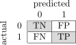
and the entries have special names. A true positive (TP), sometimes called a hit or detection, is a sample that has a ground-truth positive label and also predicted to be positive by the model. Likewise, a true negative (TN) or correct rejection is a sample that has a ground-truth negative label that is also predicted to be negative by the model. A false positive (FP), false alarm, or Type I error, on the other hand is a ground-truth negative sample that is predicted to be positive by the model, and a false negative (FN), miss, or Type II error, is a ground-truth positive sample that is predicted to be negative by the model.
It is important to note that for a sample \(x\) to be predicted as either positive or negative, a detection threshold \(t\) needs to be applied to the probability that is calculated by the model, i.e., \(p(y = 1 \mid x; \theta) \geq t\) means that \(x\) will be labeled as positive and otherwise negative. The entries in the confusion matrix are a function of this threshold. Setting a high threshold will have the model predict more negatives, whereas setting a low threshold and the model will predict more samples as positive.
We can derive several statistics from the four basic elements in the confusion matrix. Recall, also known as true positive rate, sensitivity or hit rate, is defined as the number of true positives divided by the total number of ground-truth positives,
Precision or positive predictive power is the number of true positives divided by the total number of samples predicted as positive by the model,
A less common statistic in computer vision, the true negative rate or specificity, is the number of true negatives divided by the total number of ground-truth negatives,
Accuracy, as we have already seen, is the sum over the diagonal entries divided by the sum over all entries,
A statistic that is commonly used to summarize precision and recall into a single number is the \(F_1\)-score, which is the harmonic mean of precision and recall
There are many other statistics used to report performance of binary classification methods, such as false alarm rate, false positive rate, fall-out, false discovery rate; \(F_\beta\)-score, but the ones defined above are the most common for tasks in deep learning and computer vision.
We already mentioned that the statistics above depend on a threshold applied to the probability output by the model. This results in the classification rule (for returning a positive prediction),
For multi-class problems the classification rule is sometimes applied in one-vs-all fashion,
for class \(k\). Note that this is different to the rule of taking the class with maximum probability.
By sweeping over threshold \(t\) we can trace out a precision-recall (PR) curve as shown in Figure 44. Recall, plotted on the horizontal axis increases from left-to-right corresponding to a decrease in threshold \(t\). The relationship is not necessarily monotonic and so an interpolated precision is often plotted instead,
The justification here is that in cases where precision dips, we could always chose another operating point (with lower threshold) where we get to improve recall while maintaining precision.
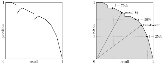
The area under the precision-recall curve is called average precision (AP). It is traditionally computed on an 11-point interpolated curve (i.e., recall ranging from 0 to 1 in increments of 0.1), which was introduced by the PASCAL VOC Challenge [26]. For multi-class tasks we aggregate AP on each category to get the mean average precision (mAP), which is a very standard metric used to compare and rank object classification models.
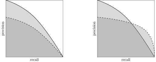
A single summary statistic is never sufficient for comparing models. Figure 45 shows example scenarios of precision-recall curves for two different models. In the plot on the left it is clear that one model dominates the other for all values of precision and recall. In the plot on the right, both models have approximately the same average precision (area under the curve) and one model isn’t strictly better than the other at all operating points. Here we would select one model (solid line) if we cared more about precision than recall, and the other model (dashed line) if our application demands higher recall at the cost of precision.
Other metrics that you will often see reported when researchers evaluate models are the number of model parameters and the speed of inference. Sometimes training time is also reported, but this is of less concern for models that are trained once and deployed to millions of users.
Two other factors should be considered when reporting performance and comparing models. First is to run with multiple different random seeds and report mean and standard deviation across the runs. Second is to report trends against one or more meta-parameters rather than a single operating point. These both give a sense of the method’s robustness and mitigates against favoring one model due to luck. However, they are not always feasible with large models/datasets. In such situations—reporting a single operating point for a single run—at least be aware that you are violating good experimental practice (and be skeptical of results reported in the literature this way).
Finally, the most important thing when developing a new model and assessing its performance is to always visualize your data and your results to make sure that your metrics align with your intuition. Every researcher has a horror story (some have several) of corrupted data, buggy code, or some other error or misunderstanding that could easily have been avoided using data visualization. We will drive this message home further in a later lecture on debugging algorithms and diagnosing problems.
4.2.2 Why Convolutions?
Let us get back to the question of why we need convolutions. At the start of the lecture we calculated the number of parameters needed for an image classifier based on a two-layer perceptron architecture that could distinguish between 10 different classes. We arrived at 150,639,010 parameters. Now let’s analyze the AlexNet convolutional neural network architecture, which can achieve much better performance than an MLP and handles 1000 different classes. With reference to Figure 41 we can calculate the number of parameters as
where, for example, the first convolutional layer applies an 11-by-11 filter kernel over the 3-channel input. There are 48 filters in the first layer in each of the two data streams, and each filter has a bias term, giving \((11 \times 11 \times 3 + 1) \times 48\) parameters for the first layer.
This represents a massive reduction in parameter count for much deeper network. The convolutional neural network architecture is also invariant to small pixel shifts thanks to max pooling, so will generalization better. Furthermore, the parameter sharing from the fact that the same kernel is applied to all locations in the feature map, also helps the model to generalize. All up, CNNs are a win-win for image classification.